

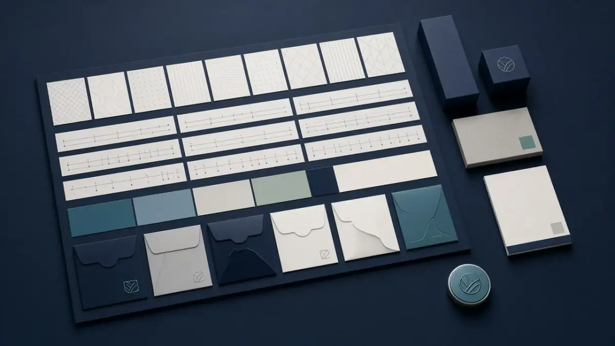
Designing in Arabic and English without compromise
Bilingual brands often fail in typography, spacing, and small interface decisions — not in the statement of intent. Here is how we design so both languages stay first-class.
Read more
When a client asks for an “identity,” they often mean a new logo. The mark matters, and it is usually the smallest part people will see in a day. They will meet a heading on a site, a short message, a post cover, an email signature, packaging, a loading screen, and sometimes a voice in a film where the mark appears only in the last second. What remains in memory is the consistency of those meetings, not a single drawing hung on the cover of a set of guidelines.
So from the start we separate the mark as a sign from the system as a way of being present. The sign is recognised; the system is lived. A brand without a system forces the team to improvise on every new piece, and the recognition paid for in the logo slowly wears away.
Close your eyes and picture brands you respect. Colour often arrives first, then the tone of a sentence, a way of cropping a photograph, a rhythm of motion — before you can recall the details of the drawing. That is not a slight on the logo. It clarifies its job: it is a key, not the whole house.
When we build a system we ask: if the mark disappeared from half the materials, would you still be recognised? If the answer is no, the identity is still a project hanging on one fragile corner. A good system lets a page, a message, and a newsletter speak in one accent even before the sign appears.
The logo answers “who is this?” The system answers a harder question: “how does this behave in situations we have not drawn yet?”
A system does not need to be an encyclopaedia. It needs a limited number of connected decisions the team can live with for months, not days. These are the decisions we insist on fixing before we celebrate that the drawing is complete.
Written tone is part of identity, and it is often neglected because it is not unveiled in a logo reveal. How does the brand address a client in an error, in a launch, in a quiet piece of news? Which sentences are refused because they sound borrowed from a competitor or from a general wave? A short voice guide, with Arabic and English examples where needed, protects the face more than an extra shadow under the symbol.
Voice is tied to type. Choosing an Arabic face and a Latin face is not a later cosmetic step. It is the brand’s voice continuing into the page. The weight of headings, the measure of body copy, the behaviour of numbers: all of these tell a reader whether the brand is serious, close, or technically precise.
Once the sign is approved, we turn the conversation to use. The list below is not a template forced on every sector, but it covers the gaps we have seen repeat when a logo is delivered without a system.
Live templates matter more than theoretical pages. The team needs to see the system solving this week’s problem, not decorating a manual that is browsed once.
We do not delay use until the guidelines reach a state of “completeness.” We build a first loop that can live, then widen it when a need repeats. That protects the project from remaining stuck in a polishing phase.
The first month after delivery matters more than the week of the reveal. That is when it becomes clear whether the system is a tool or a congratulatory file. A calm review in this period saves a year of quiet branching.
The point is not to shrink the joy of a new sign. It is to put it in its right scale. A precise logo in a confused system will, after a few months, look unfinished. A clear system can carry a simpler sign than some people imagine, because recognition has been distributed across voice, image, and rhythm.
In crowded markets, that distribution is kinder to people. They will not study your guidelines. They will pass you quickly in different channels. The system is what makes those passages consistent, so familiarity is built without shouting the name in every frame.
A logo is a beautiful key, and a key is not a house. The system is the rooms your team and your clients will live in after delivery day: the words, the spacing, the images, and the small decisions that repeat. If you have a new sign looking for a wider life, or an identity worn down by improvisation, that is the place to work.
We like to start from real use, not from the cover page. Talk to us, and we will build a system that makes the logo the smallest visible part — not the only part you can rely on.

Head of Design
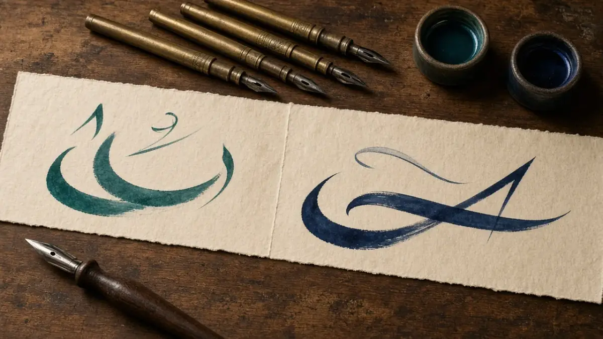
Bilingual brands often fail in typography, spacing, and small interface decisions — not in the statement of intent. Here is how we design so both languages stay first-class.
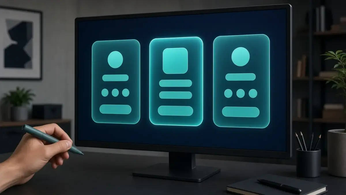
A pricing page fails when packages are invented in a sales deck and then decorated by design. Treat it as a product surface: offer, proof, and a calm path to choose.
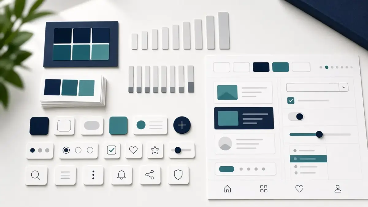
A Figma file full of components is not a system until it changes how a team decides. Here is the difference, and how we build something people actually use.
We will review your site or campaign and build a clear plan for the next step.